A chart is a graphical representation of data. Charts are particularly useful for summarizing numeric data and showing the relationship between sets of values, called series. For example, a chart can show hours by location, job, or cost center over 3 months.
To use charts in your report designs, complete the following steps.
You can add a chart to the entire report or to a section within the report. The method you use to insert a chart determines what data is available to the chart.
- To make all data that is available to the report design available to the chart, click Visualization, select a chart type, and drag it to the layout pane.
- To make only data that is available to the table available to the chart, select the table, select Insert > Chart, and then select the chart type.
- To make only data that is available to the section available to the chart, select the section heading, select Chart > Insert Section Charts, and then select the chart type.
The table or section in which you insert a chart determines what data the chart displays. For example, in a lengthy report, a chart at the table level can display hours and cost center totals for the company, while a chart at the location section level can display hours and exceptions for each location.
Report Studio provides a number of different chart types for use in a report design. Several of the chart types include subtypes. See for more information.
A chart shows the relationship between sets of values called series. There are two types of series: value and category.
- A category series determines how to group the values, for example, by year, by country, or by cost center. For charts that use axes, category series values appear on the x-axis.
- A value series contains numeric values, such as actual hours or scheduled hours. These values determine, for example, the height of a bar in a bar chart or the size of a sector in a pie chart. For charts that use axes to display data, value series values appear on the y-axis.
For all chart types, you must select one column as the category series and at least one column as the value series. You can select two columns to display two value series.
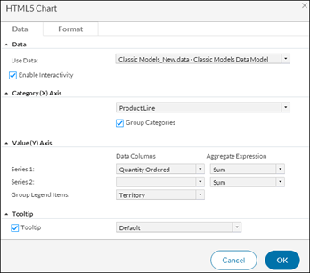
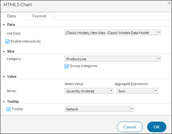
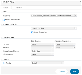
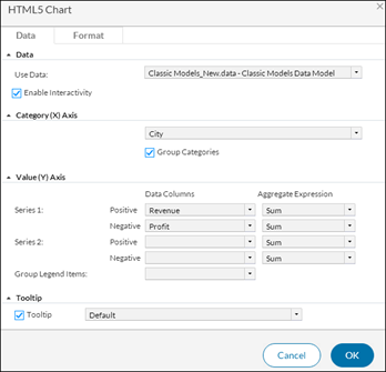
You enter the applicable information in Data tab of the HTML5 Chart dialog box, which contains the following fields:
Use Data — Select the BaseDataSet of report data object from the drop-down list.
Enable Interactivity — Sometimes data fields in data objects contain hyperlinks. Hyperlinks enable users to open a URI or drill through to another report document file when choosing a value such as a customer name in a table. If hyperlinks exist, you can select whether to display them in a chart or table. To display existing hyperlinks in a chart, select Enable Interactivity. To disable existing hyperlinks in a chart, deselect Enable Interactivity.
Select the category series value from the drop-down list to determine how to group the values.
Group Categories — When the category axis contains too many values for which to display data individually, you group the values on the category axis by selecting this check box. When you group the category axis values, the value series data is aggregated.
Select the numeric values, such as actual hours or scheduled hours. The cataegories available vary, depending on the chart type, but can include:
- Series — Shows the relationship between sets of values. There are two columns: Data Columns and Aggregate Expression.
- Data Column and Aggregate Expression — Select a category from the drop-down list of the Data Column and then select the corresponding Aggregate Expression. For more information about aggregate expressions, see .
- Group Legend Items
- Time interval
A tooltip displays the value series value when a user hovers over a bar in a bar chart, a sector in a pie chart, or a data-point marker in a line chart. You can disable the tooltip by deselecting the Tooltip option. You can also display a different tooltip value. To display a different tooltip value, select a different column from the drop- down list.
The fields included in the HTML5 Chart dialog box vary depending on the type of chart selected.
Area charts, bar charts, column charts, and line charts can often be used interchangeably to display the same types of data.
The following is a sample bar chart:
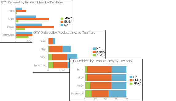
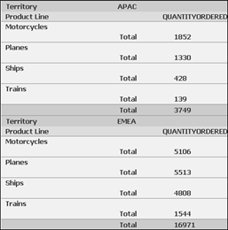
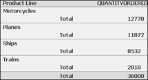
The following shows some of the data to use in the chart. This data is already aggregated. The data shows the total quantity ordered by product line.
Each value is plotted in each of the charts
The following data is selected in the HTML5 Chart—Data for the overlay area, overlay line, side-by-side bar, and side-by-side column charts in the earlier examples. The Product Line column is the category axis and the Quantity Ordered column is the value axis. The category values are grouped by product line, and the legend values are grouped by territory.
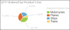
Unlike other chart types, a pie chart can display only one value series. For example, a pie chart can show sales totals by product line, but it cannot show sales totals and profit totals by product line.
The following pie chart:
The following shows the data that a pie or doughnut charts could use:
The following shows how the data is selected for the charts. The Product Line column is the category series, and the Quantity Ordered column is the value series. In addition, the data is grouped by product line, and the SUM function calculates the total quantity ordered for each product line.
Unlike most chart types, a meter chart does not display data on a y- or x-axis. Instead, a meter chart displays each data value as a needle on a dial. A meter chart is used to emphasize a small number of values.
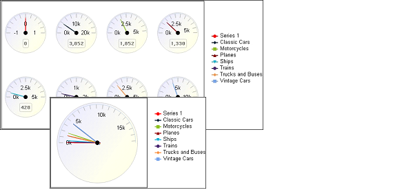
The following shows the data that the chart could use. The meter chart displays the aggregate values in the Profit and Revenue columns.
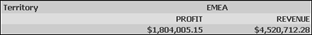
The following shows how the data is selected for the chart. A category series is typically not essential to a meter chart, but is required in this chart, which displays profit and revenue for each territory, so the Territory column is selected. The aggregate data in the Profit column and the Revenue column are the value series.

A scatter chart displays data as x-y coordinates. It combines each pair of numeric values into a single data point.
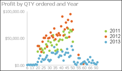
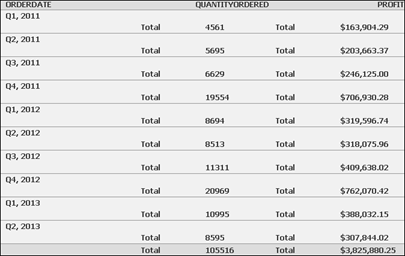
The following shows the data that the scatter chart uses. The chart uses data from the Quantity Ordered and Profit columns.
The following shows how the data is selected for the chart. The Quantity Ordered column is the category series, and the Profit column is the value series. The data is grouped by the category axis values, and aggregated using the SUM function for the Profit column, to display total profit. The legend is grouped by order date using the year interval.
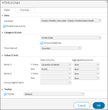
A bubble chart resembles a scatter chart, but shows data as bubbles instead of as points. Two numeric values, sales quarter and quantity ordered, define the position of the bubble, and a third numeric value, profit, defines the size of the bubble.
The following shows the Order Date column, grouped by the quarter interval, is the category series and the Quantity Ordered and Profit columns are the value series. The SUM aggregate function calculates the total quantity ordered and profit values for each quarter.
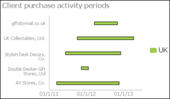
A Gantt chart typically requires the following data:
- Tasks as the category series
- A date or time as the value series, showing the task beginning and end information
The following shows a Gantt chart: one axis contains the time series and the other contains the task being measured. Gantt charts display schedules that use bars to show beginning and ending dates for multiple tasks. The Gantt chart measures the ordering activity period for each customercustomer.
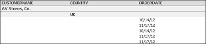
The following shows the data for the Gantt chart.
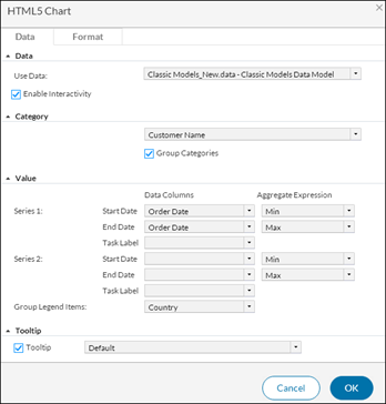
The following shows how to specify the data used for the chart.
A difference chart typically requires the following information:
- A non-numeric data field for the category series
- Two sets of data values, for which deviation is measured, as the value series
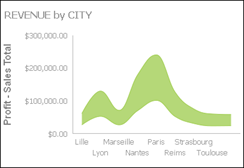
The following difference chart calculates the deviation in revenue values by city.
Part of the data for the chart is:
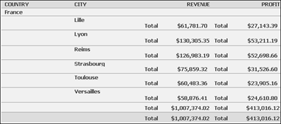
The City field is set as the category axis, and the Revenue and Profit field are set as the value axis fields. The value axis fields can include multiple series. Both value axis fields use the SUM aggregate function to display total revenue and total profit values.
When you create a chart and use the default formatting options, the chart type and the data you select determine the basic look of the chart. Report Studio determines styles, such as fonts and colors. You can often improve the appearance of a chart by editing the placeholder text for the chart title, y-axis title, or x-axis title, and by changing the size or position of the x-axis labels.
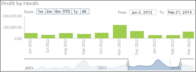
Timeline charts can be enhanced to provide zooming options such as the time range selector, scrollbar, and a timeline slider. Using these options is useful when navigating data in a lengthy report that includes a time dimension showing data for hourly or daily stock values over a period of several years.
You can select a time range selector and a timeline slider bar for users to set time intervals in area, bar, column, difference, line, scatter, and stock charts.
- Title — Add a title for the chart.
- Theme — Optionally select a predefined theme to change the appearance of the chart.
- Width and Height — Specify a width and height for the chart.
- Subtype — Select a subtype from the available options based on the data you want to present in the chart.
- Use Glass Style — Select this option to show smooth, rounded Rounding is a way to simplify payroll accounting and reporting, and to enforce shift start and end times. Punch rounds divide hours into equal segments of an hour. edges for bars or columns in a chart.
- Allow zoom into — Select this option to enable users to closely analyze details for a specific area on the axis.
- Auto scroll bar — Select to enable users to scroll vertically or horizontally, for charts that are too wide.
- Show Legend — You can specify whether to display a legend and select its position.
- X-axis title — Provide a title that appears below the x-axis.
- Y-axis title — Provide a title that appears to the left of the y-axis.
- Axis label properties
- Is Category Axis — Select if you want the x-axis to display the category for each data point, for example Qtr1, Qtr2, and Qtr3. Deselect to display scaled numerical values.
- Show Labels — You can specify whether to display axis labels.
- Stagger Labels — This option places the labels in a zigzag arrangement on the x-axis.
- Labels Interval — This value on the x-axis is set to 1 by default, which means every value appears. To display alternate values, select Stagger Labels and set Labels Interval to 2.
- Labels Angle — This option places the labels at the specified number of degrees to the axis.
- Minimum Value — Type a number that represents the lowest value to display on the y-axis. This number appears at the bottom of the y-axis.
- Maximum Value — Type a number that represents the highest value to display on the y-axis. This number appears at the top of the y-axis.
- Auto Step — Select to accept the default step interval on the y-axis or deselect to specify a step interval. Type a number that represents the increment between each value in Step Interval.
You can also modify or delete a chart and display a chart without a table.
To modify a chart, right-click the chart and select Edit. The chart properties appear to the right of the chart. You may have to scroll to the right to see the property sheet.
To delete a chart from a report design, select and right-click the chart. Select Delete. The chart no longer appears in the report design.
If you insert a chart at the table level and you want to display the chart but not the table, right-click anywhere in the table, and select Hide Table. Select Show All to re-display the table data.